Request: Chain Views in Ableton Live
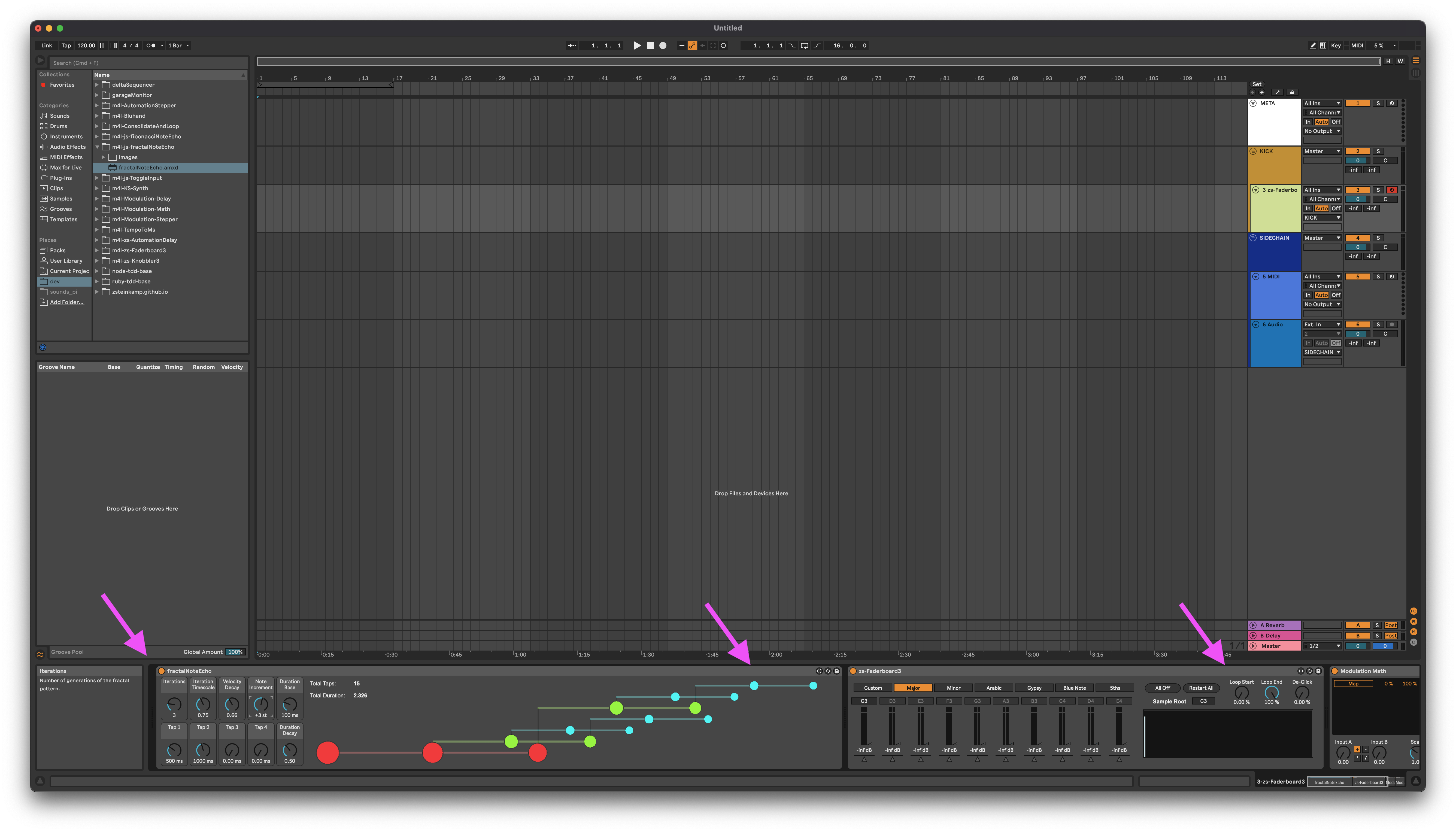
As an Ableton Live user, I appreciate its approach to interface. Part of their interface philosophy is the extreme consistency within the Ableton-provided devices. This allows for a deeply opinionated model for user experience, since many basic constraints like "device height" are controlled. This allowed Ableton to make the decision to devote a slim portion of the bottom of the interface window to present a track's devices.
This component scrolls horizontally to display more than a screen's width of devices.
For a large portion of users, this is 100% fine. Their chains tend to not be complex, and thus can see everything they need or want to see to control the devices at the same time.
There are some users, like me, that give as much effort to designing the sounds as well as the music. This can oftentimes lead to very complex device chains, spanning many screenfulls and even popping into additional dimensions by using Racks (parallel chains of devices).
In these cases, it can be laborious to navigate to a specific device that you want to navigate to, or just to comprehend the signal path. Not only can you have multiple parallel signal paths, but you can have devices modulating other devices, either via a Sidechain connection or with parameter modulation.
In the way that Ableton displays a track's devices, the above scenario places a large cognitive load on the user. The complex interconnections and multiple signal paths have to be held in the user's imagination, since there is no visual indication on the screen. This takes away important focus and flow from the creativity process.
In this post, I propose two new views for the Ableton Live user interface. These views are intended to make the process of sound design more efficient by devoting more space and displaying new information to the user, with the intent of minimizing cognitive load of having to synthesize an understanding of what is happening by displaying it directly.
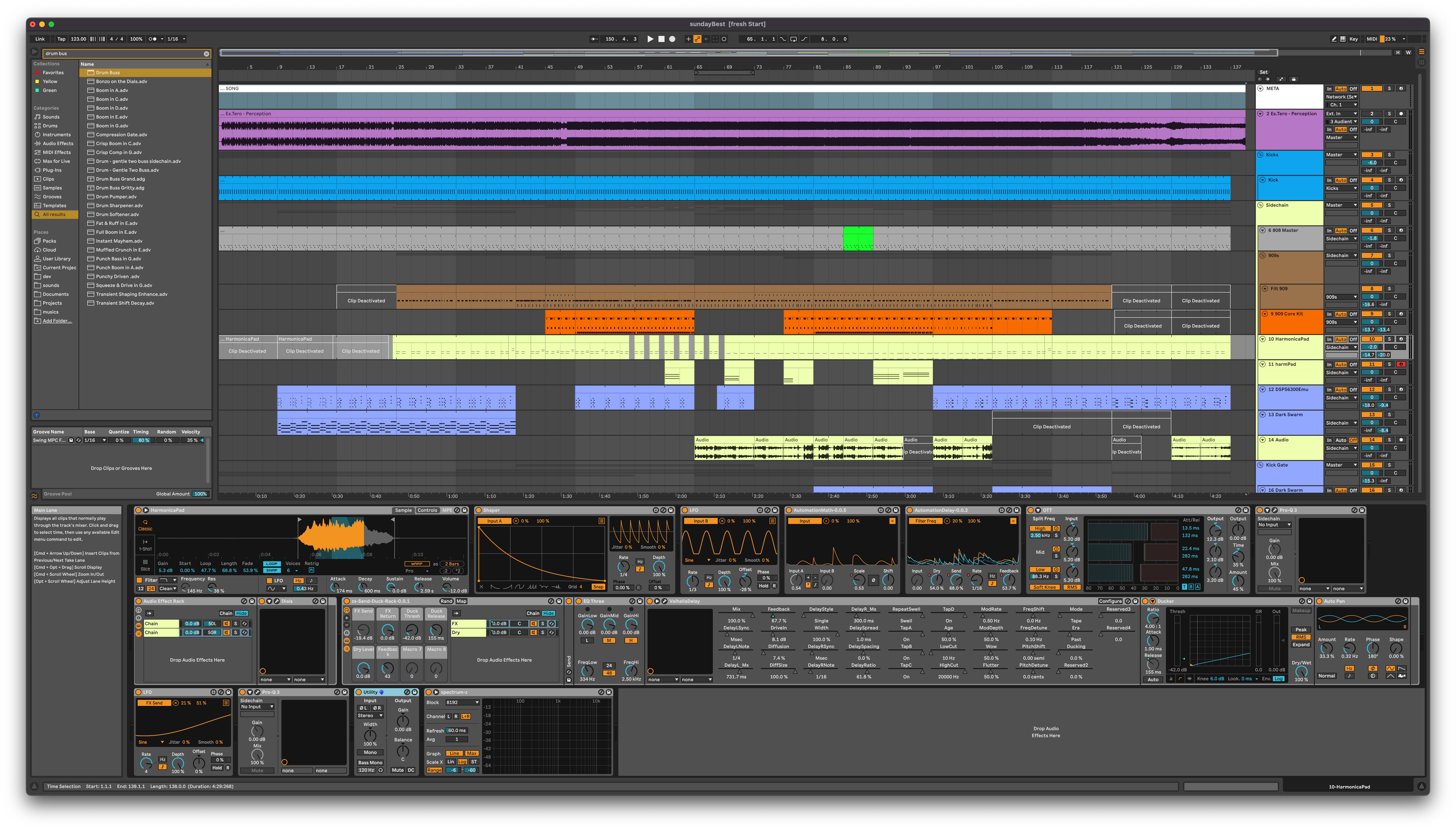
Chain Lane View
This view is a small enhancement on the current implementation. Chain Lane View lays out your devices left to right, top to bottom using as many rows as is necessary. The section of the view is resizable, so the lanes will scroll vertically if need be.
The advantage of this view is being able to see all of the devices (well, in a single signal path) on the screen at once, which may be important for more complex chains.
Third party plugins would be handled as they are today -- with the wrench icon in the device title bar used to toggle visibility of the plugin window.
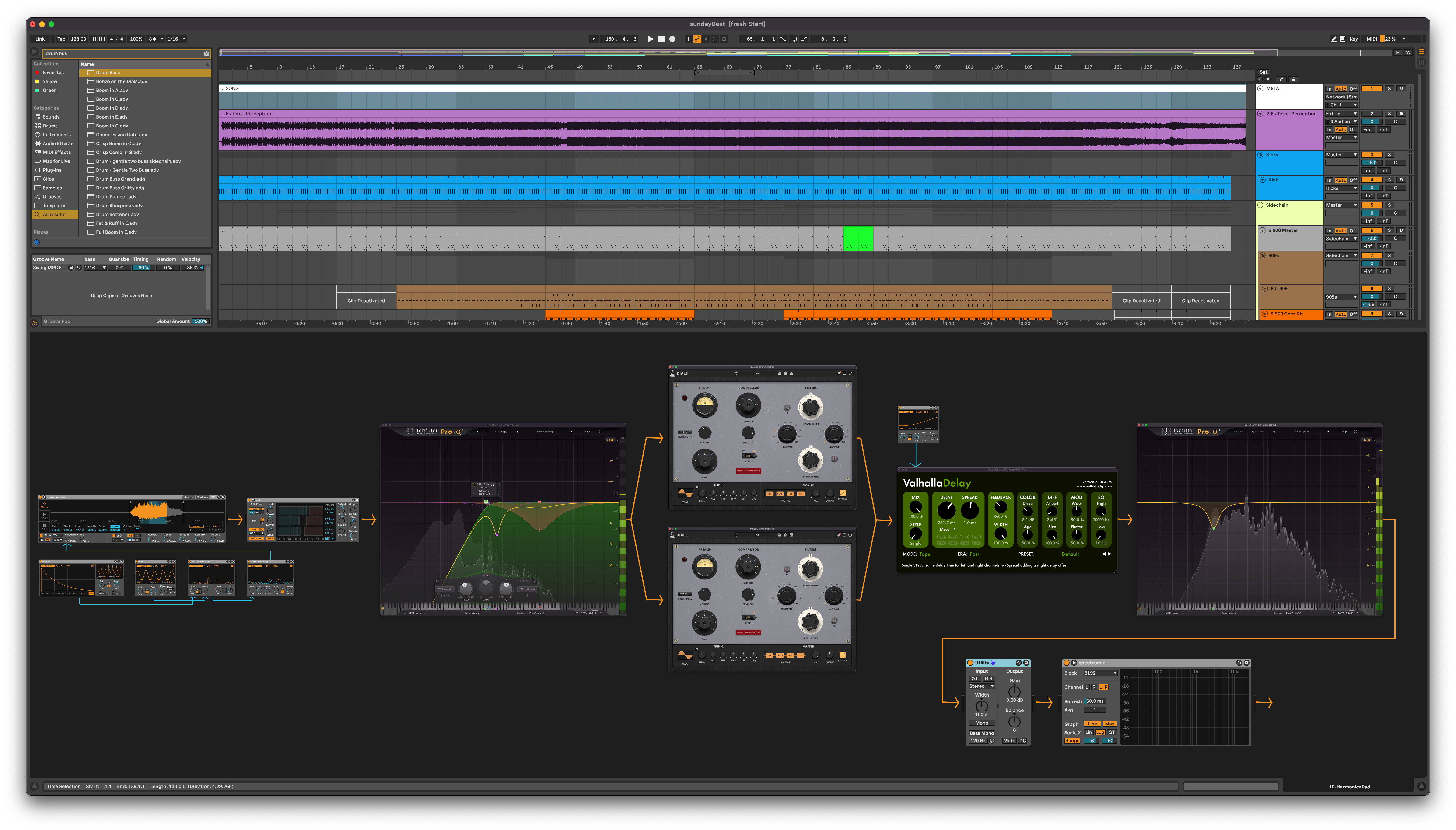
Chain Flow View
This, I think, is the more innovative and useful view for a sound designer. In Chain Flow View, all devices - including third party plugins! - are displayed in a zoomable, pannable space. This would be a buttery smooth experience, with >= 60fps performance for zooming and panning. Audio signal paths, sidechain connections, and parameter modulations are represented visually. To have third party plugins are displayed in context, rather than in floating windows with no connection to their places in the signal chain, is a real game changer.
Wrap-Up
Entering into the Chain View should be a mappable UI element. Once in Chain View, there should be another mappable element once in Chain View to toggle between Chain Lane and Chain Flow view.
I think that with these new views, workflows with a focus on sound design will be more efficient, thus leading to a higher degree of creativity.


